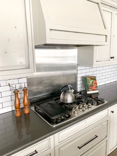
One of the first comments people usually make when they see our kitchen for the first time is that our cabinets look ‘beat up’. Well, I think this is where our custom cabinet maker thought I was nuts, but I wasn’t going to budge on the distressed look. The material is knotty alder, and we chose all of the wood that had the greatest amount of natural knots and ‘imperfections’. Then, combined with black glaze and iron knobs and pulls, this kitchen has the appearance that the cabinets are older or re-purposed, when in fact they are brand new. I know this is a unique look, and it’s not for everyone, but it really came together in the end and I couldn’t be happier with how it turned out.
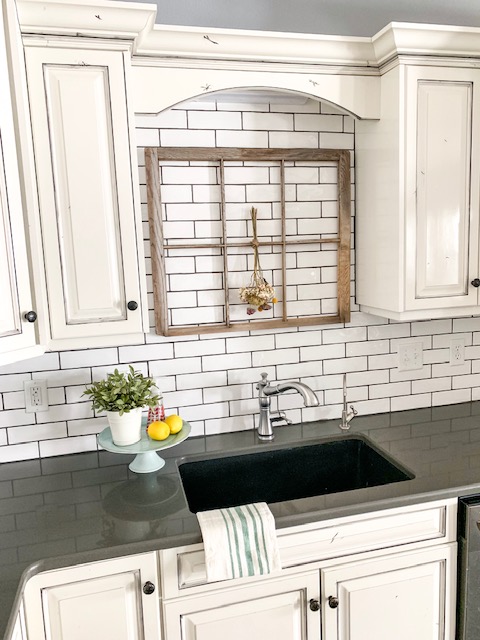
Ok, fast forward a couple of years to present time, and the last of the subway tile was installed over the kitchen sink. During the notebook paper design phase, I had pictured a window for this space but it was not feasible since the garage was on the other side of the wall. I still decided to put a window in this space, but just had to be a bit more creative.


